
I have received data for the 2011 SFUSD school assignment. The table in the appendix breaks down assignment by ethnicity. I have been interested in the racial distribution among the San Francisco schools. So I created the chart below to see the observe the pattern.
Each school is shown as a ring. The length of the color arc is proportional to the percentage of the corresponding ethnic group in the school. And the size of the ring is proportional to the size of the school. The school with similar racial make up move close to each other.
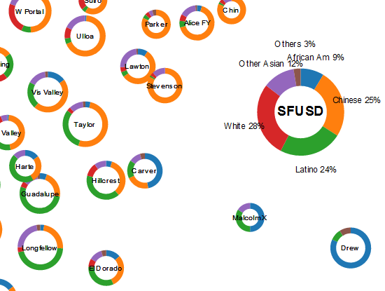
See the full chart
San Francisco Unified School District is a very diverse district. The three main groups - white, Chinese, Latino each represent about a quarter of the population. The list of schools below are the most well mixed (i.e. most similar to the overall distribution)
- Sheridan
- Starr King
- Muir
- Ortega
- Lakeshore
On the other hand, there are also a number of schools that has a dominant racial group. You can easily identify them as Chinese schools, Latino schools, etc.
P.S. -- Updated chart to include 6th and 9th grade data. There aren't a strong pattern like the Kindergarten. The big story is really that white, the largest group in Kindergarten assignment, is only 13% here. Asian constitute 50% in 6th and 9th grade. (3/27)
Data Source
SFUSD STUDENT ASSIGNMENT
MARCH 2011 SCHOOL ASSIGNMENT OFFERS
March 18, 2011
Appendix E: School Offers
Five Year Comparison of Round 1 Demand
March 12, 2010
SF Montessori opening is estimated
2011.03.21 - comments
 Site feed